Estrategic redesign

Product

Pedix

Challenge

Drive sustainable growth

Duration

4 months

image
01

+85%

Top-tier adoption jumped from 20% to 85%. We made pricing clearer, value stronger, and plans more aligned with user needs.

02

0%

We removed the free plan. Retention held steady. Users didn’t churn, they understood the product was worth paying for.

03

35%

35% of upgrades became organic. Clearer messaging, better UX, no sales calls needed. The product started selling itself.

The process

image
Map

Understand the user's needs and context

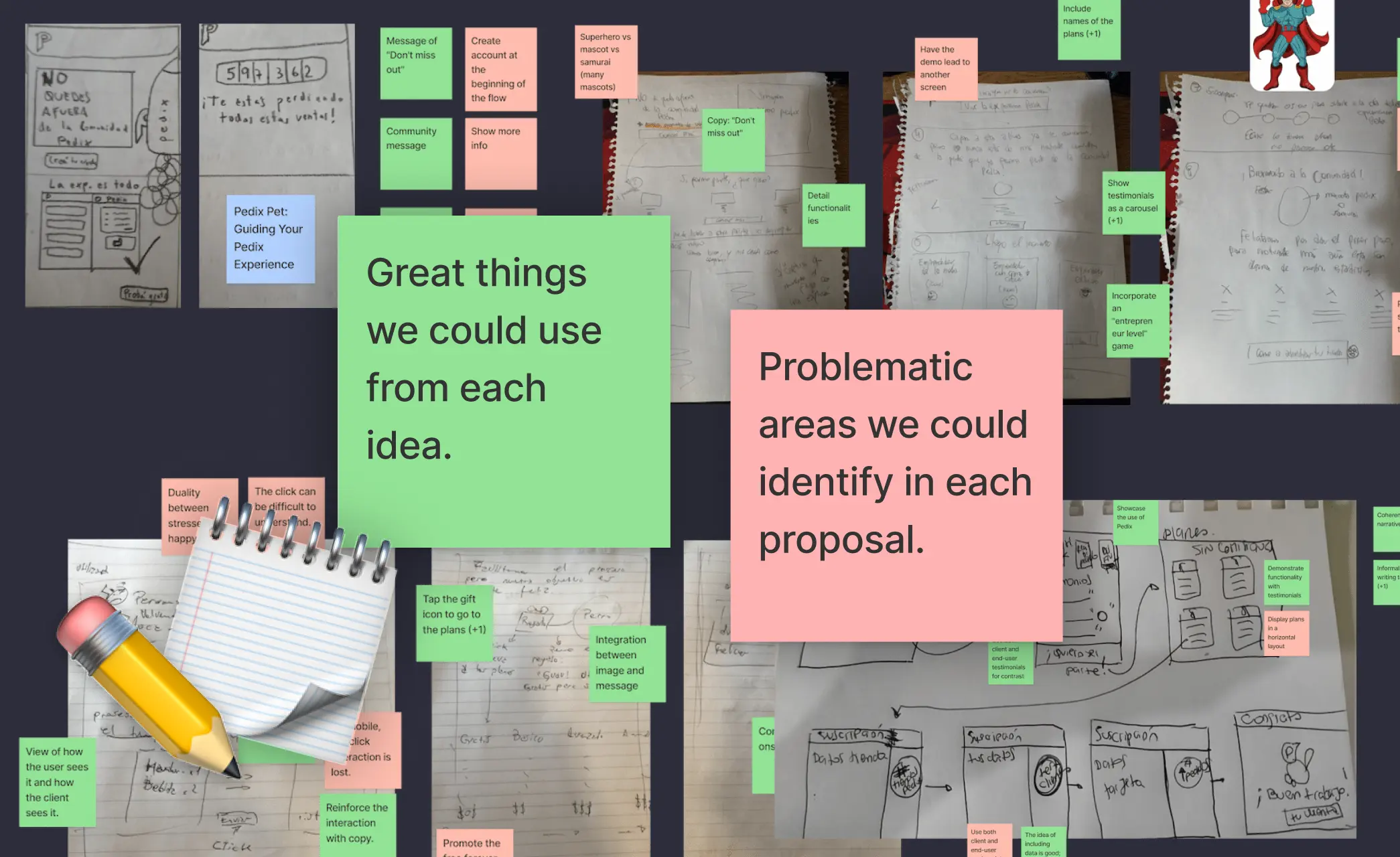
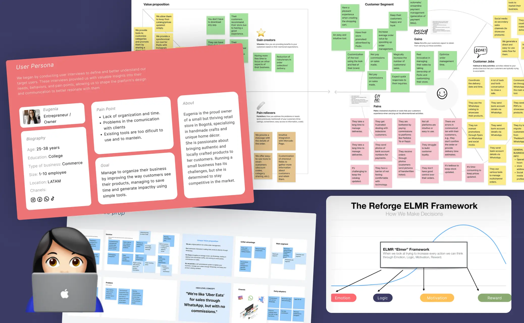
We began with qualitative research, real user interviews with small business owners across LATAM. We uncovered key pain points:

  • • Too many tools, too complex

  • • Not enough time to manage it all

  • • Pricing confusion and low perceived value

Using the ELMER Framework from Reforge, we shaped the strategy around human decision-making: emotion, logic, motivation, and reward. This shifted the product from “functional” to irresistibly valuable.

ELMER

Psychological drivers of user behavior

image

Emotion

"This finally feels made for me"

Insight

Users felt overwhelmed, intimidated, or unsure they were "tech-savvy enough"

what we did

• Chose plain, empathetic language

• Avoided buzzwords, everything sounded human, warm, and familiar

Result

Users felt safe, seen, and in control Messaging removed intimidation.

image

Logic

“This actually makes business sense”

Insight

Users needed a clear reason to pay. The site had to explain how Pedix worked, and why it was better than the status quo.

what we did

• Focused on WhatsApp integration, no commissions, and catalog simplicity

• Reorganized the homepage to answer key business questions upfront

• Made the pricing table radically transparent — no hidden asterisks

result

Objections dropped. Users understood the ROI within seconds

image

Motivation

“This is a tool to grow, not just to use”

Insight

Pedix wasn’t just a product — it was a stepping stone to professionalization.

what we did

• Shifted tone from technical to aspirational

• Used verbs like “Boost,” “Grow,” and “Sell better” instead of “Subscribe” or “Buy.”

Result

More users perceived value in upgrading — it felt like a business move, not a cost.

image

Reward

“I can see the impact right away”

Insight

Users were more likely to convert if they saw results fast.

what we did

• Added social proof (real user testimonials in a carousel)

• Used copy to celebrate key milestones (“Over 1.5M orders processed”)

• Embedded soft nudges throughout the site to create mini “win” moments

result

More users perceived value in upgrading — it felt like a business move, not a cost.

image
Sketch

Collaborative sketching fueled by research-driven insights

We took raw research and quickly translated it into low-fidelity sketches.

→ What clicked, we kept.

→ What confused, we redesigned.

This early validation helped:

• Align the team on priorities

• Spot and solve friction points

• Ground every design in a real user insight

image
Decide

Mapping the MVP with a user story map

To avoid bloated development, I led the creation of a user story map. We used it to:

• Visualize the ideal flow from signup to payments

• Prioritize core functionality

• Spot unnecessary features early

Result:

A streamlined MVP that delivered real value fast.

image
Prototype and Test

User feedback to refine and simplify

I ran tests with real store owners to:

• Refine the messaging

• Cut cognitive load

• Improve emotional resonance and clarity

We weren’t just testing UI — we were testing the story. And when the story clicked, upgrades followed.

image

Impact

Clearer value, better conversion, stronger growth, without pushing.

+85%

Top-tier adoption jumped from 20% to 85%. Clearer value and simplified pricing made upgrading the natural next step for serious users.

0%

Free accounts dropped to zero after removing the free plan. Users stayed, proving that real value beats free when the product solves real problems.

35%

35% of upgrades now happen organically. Better messaging and UX drive conversion, no sales calls, no hand-holding.